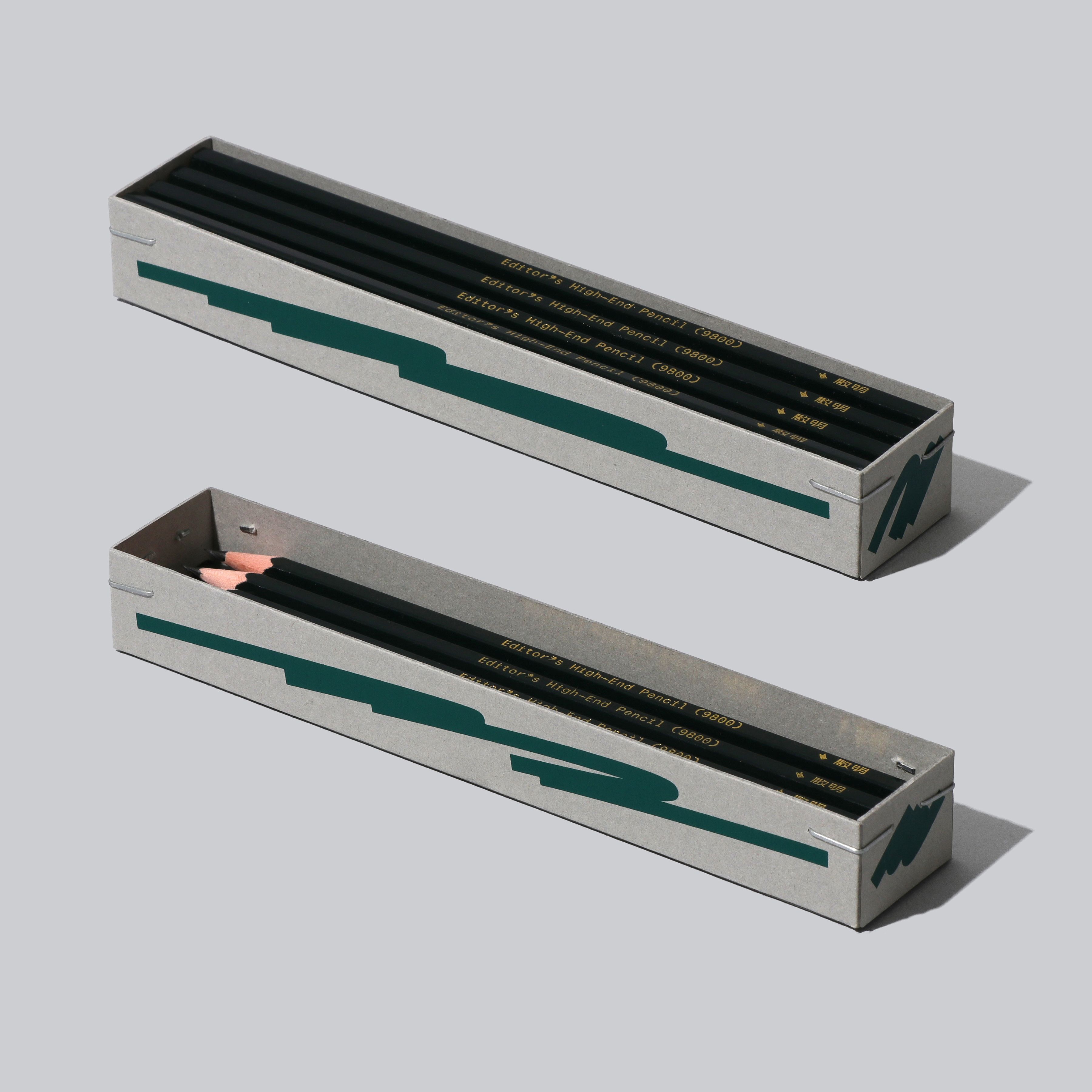
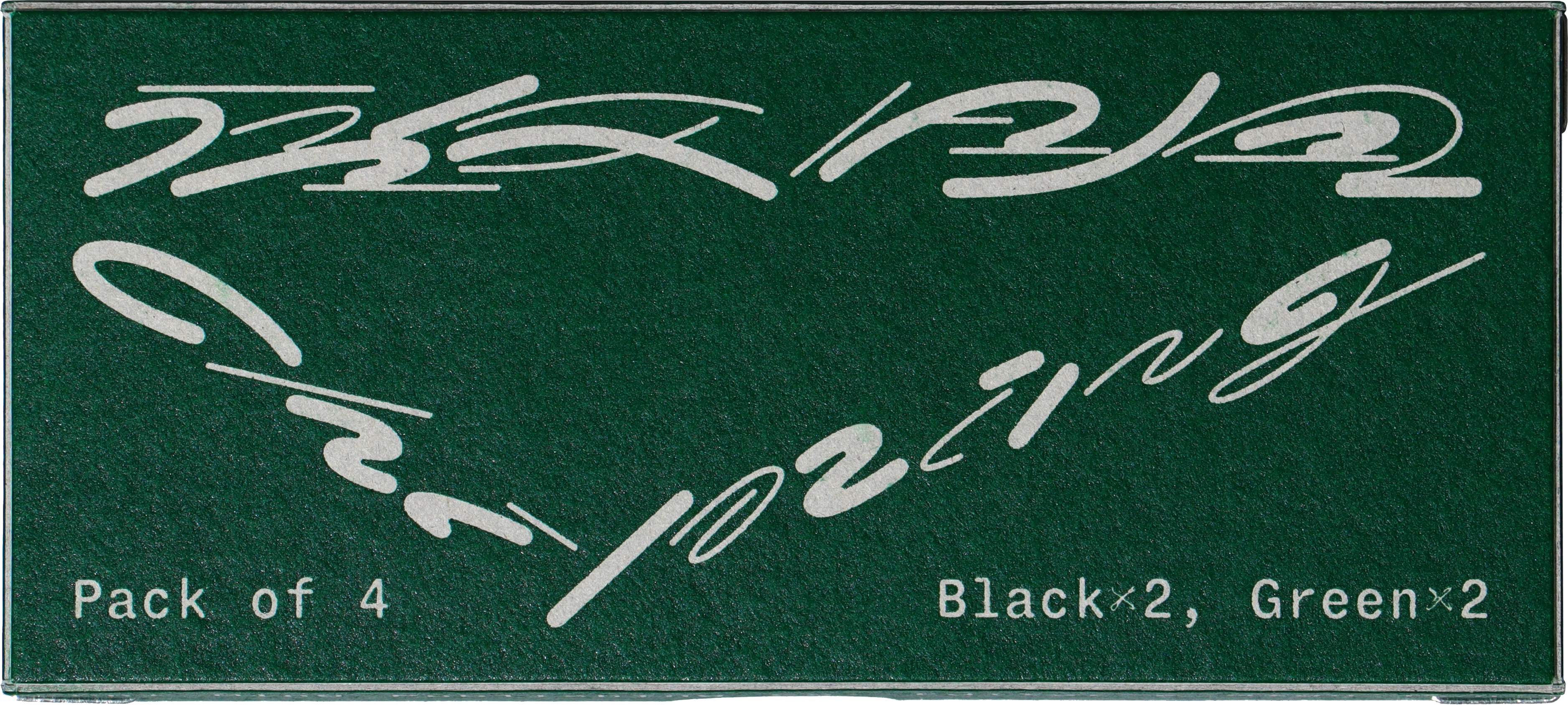
Chi Ming Editor’s High-end Pencil & Sign-Pen, designed with Sample Animal, 2023-2024. The design transforms handwritten strokes into playful graphics, encapsulating the dynamics of writing, complemented by custom typefaces that amplify the concept. The Kanji characters draw inspiration from the letterforms found on old pencil packaging. The Latin typefaces are modified versions of the open-source Fragment Mono, incorporating handwritten symbols and letterforms optimized for small print on pencils. The packaging, crafted from gray cardboard and assembled with Cornervery right-angle staples, forms a rough yet refined aesthetic. Available from Chi Ming Publishing. (Photo: Sample Animal)
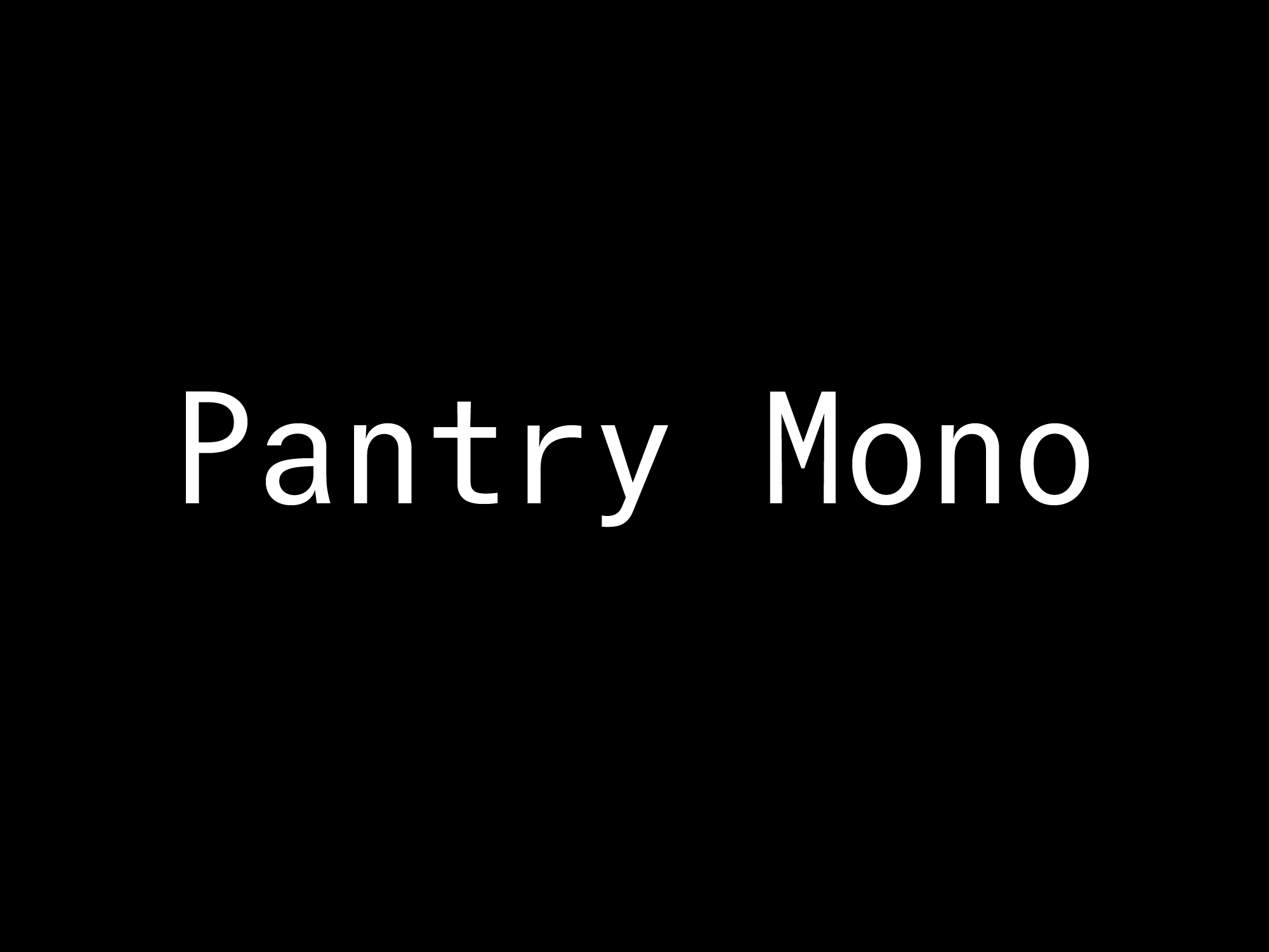
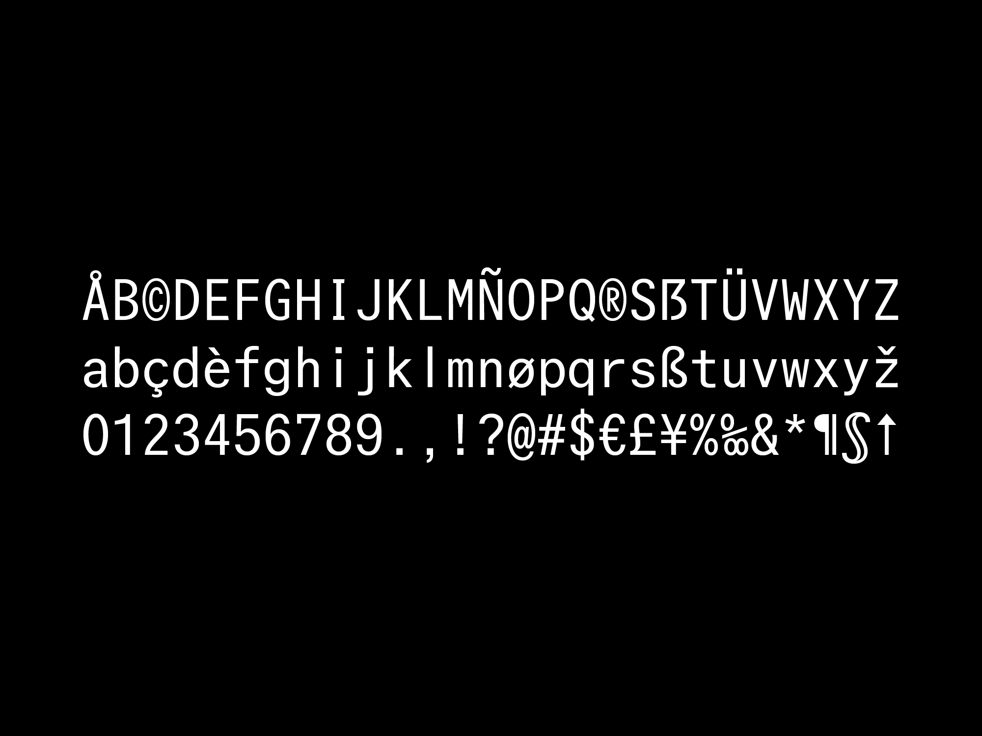
Pantry Mono, 1 style(WIP). Inspired by the Latin characters found in the streets in Taiwan, particularly the Emergency Exit sign found on buses.
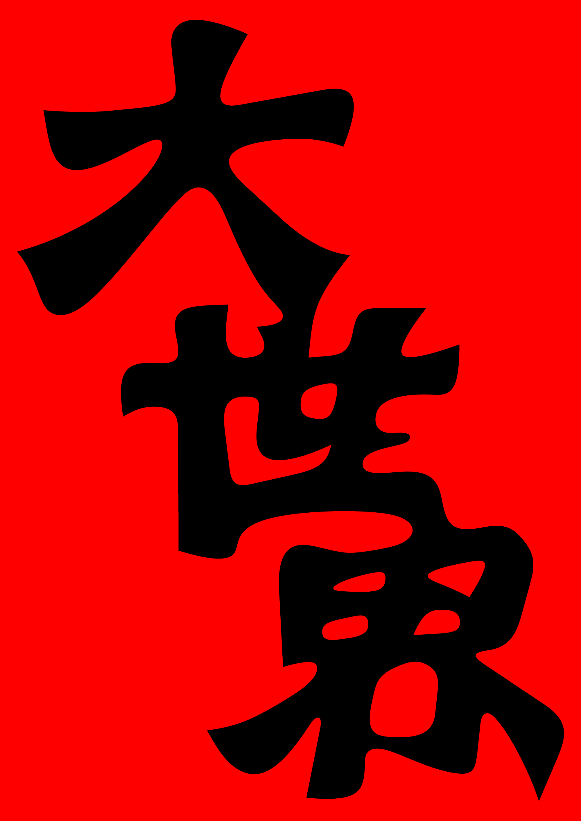
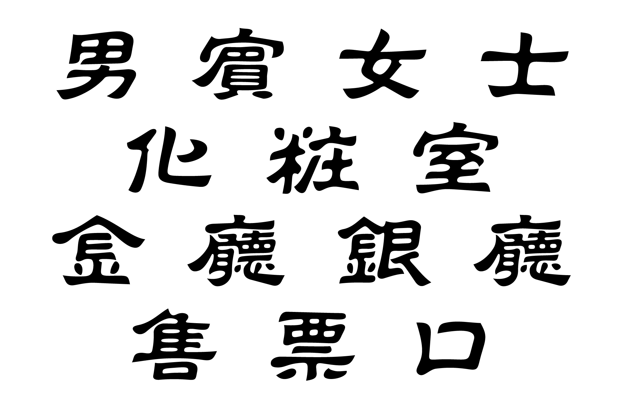
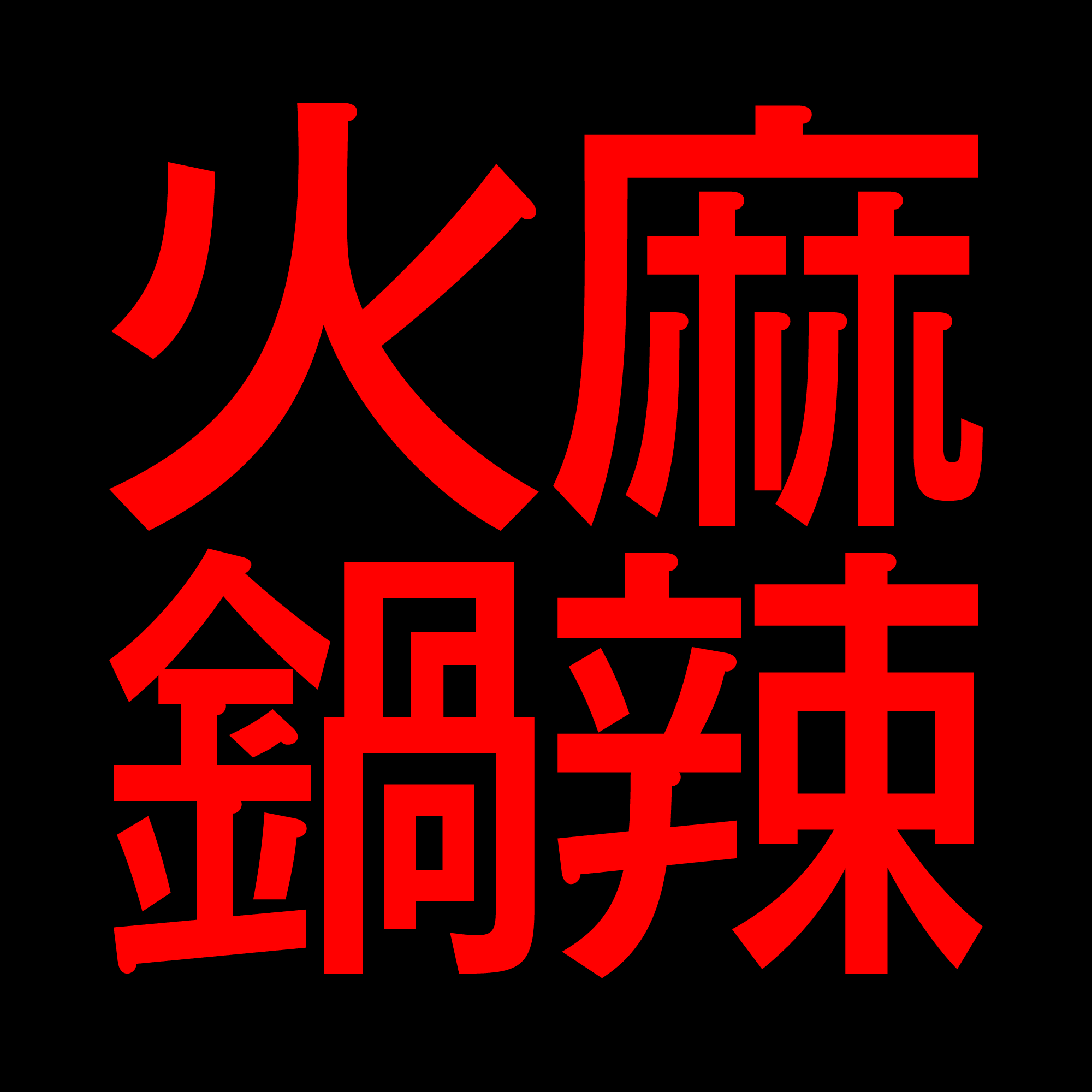

Custom type and lettering for Chan Chi Hop Pot Lab Ximen Great World, designed with Sample Animal, 2023-2024. The design of the Kanji characters in the typeface were inspired by vintage Taiwanese street sign typography, capturing the rustic, wild, and surprising aspects of Taiwan’s everyday life landscape.
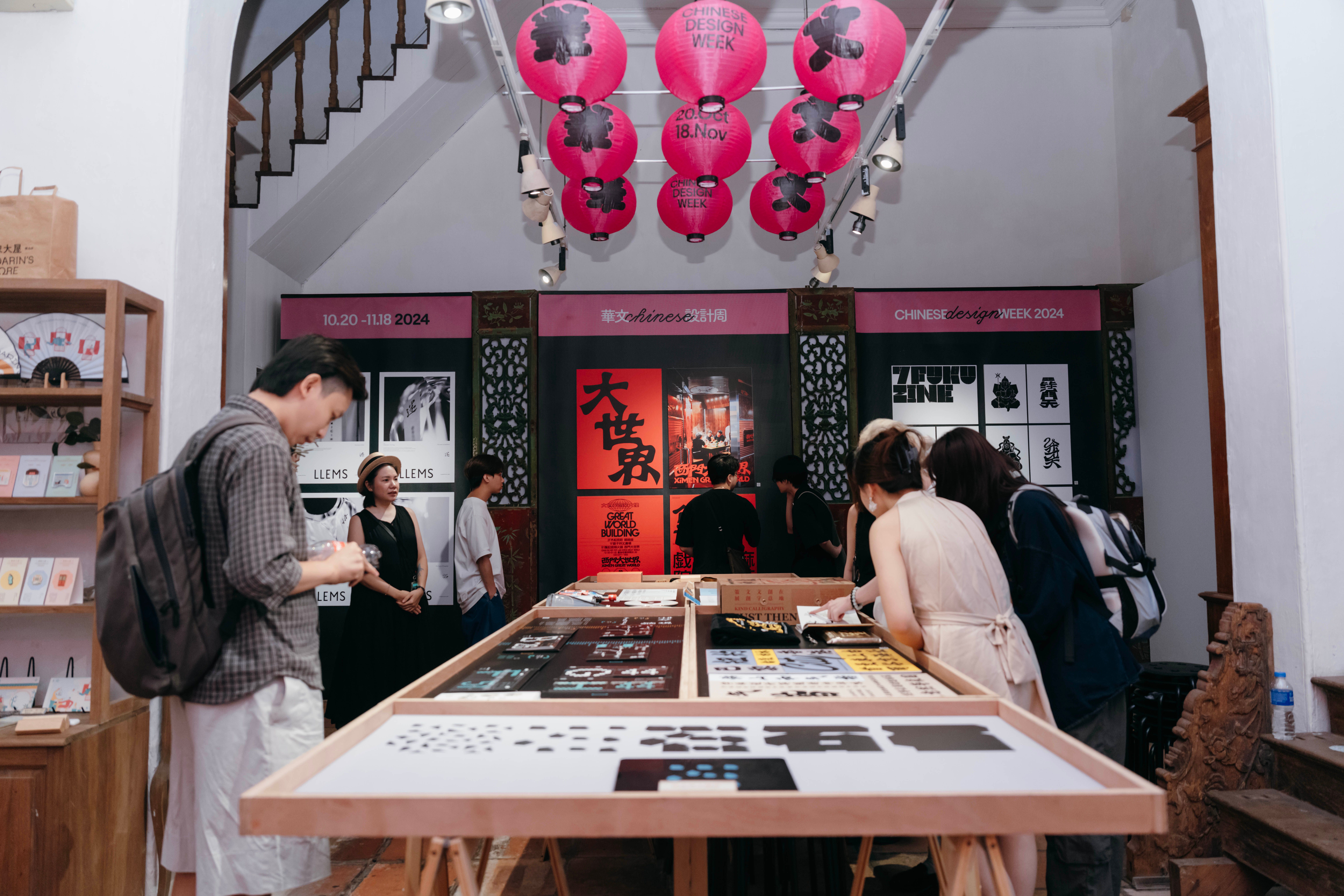
The work was exhibited in Chinese Design Week, CTCC Macau, 2024. (Photo: CTCC Macau)
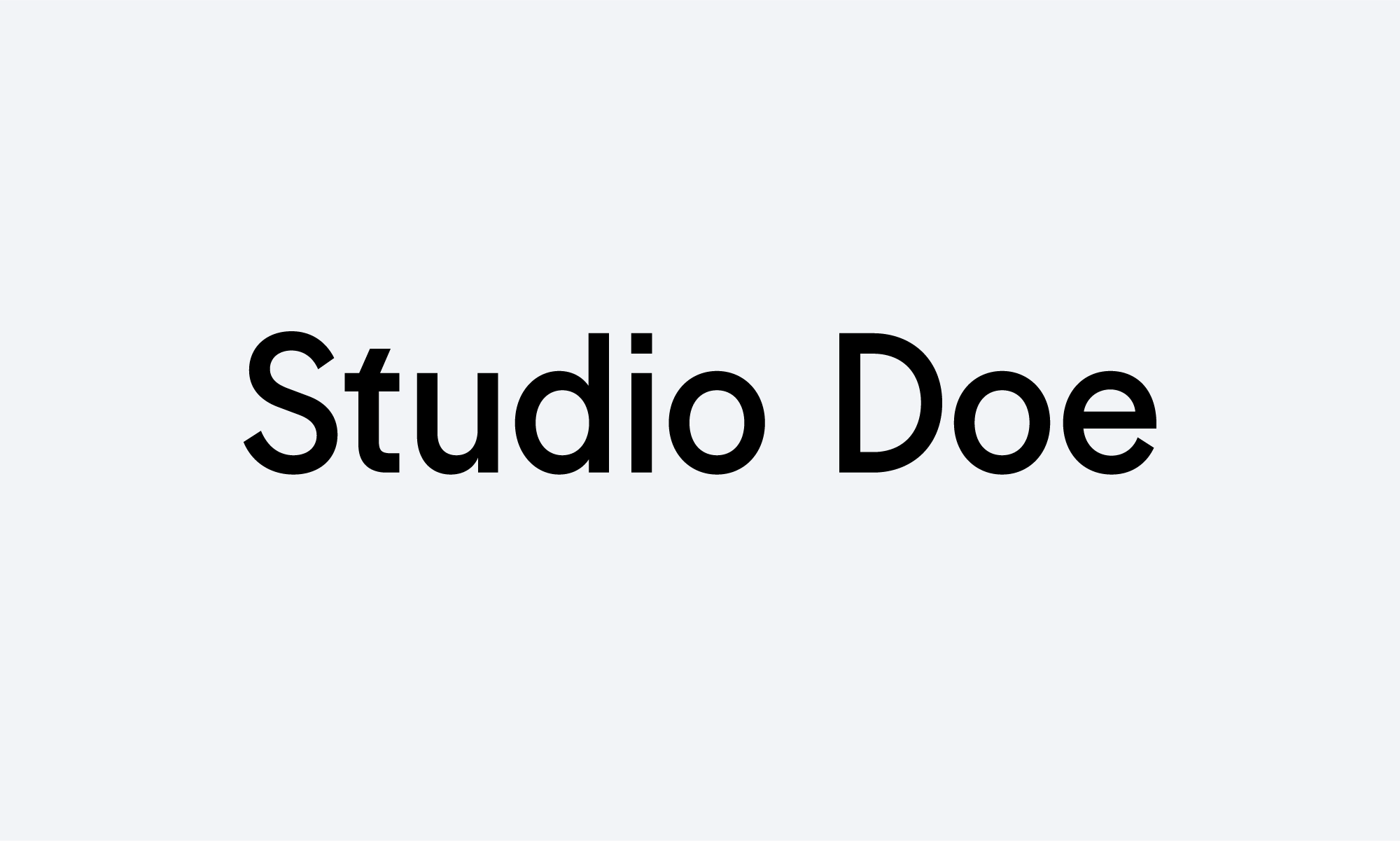
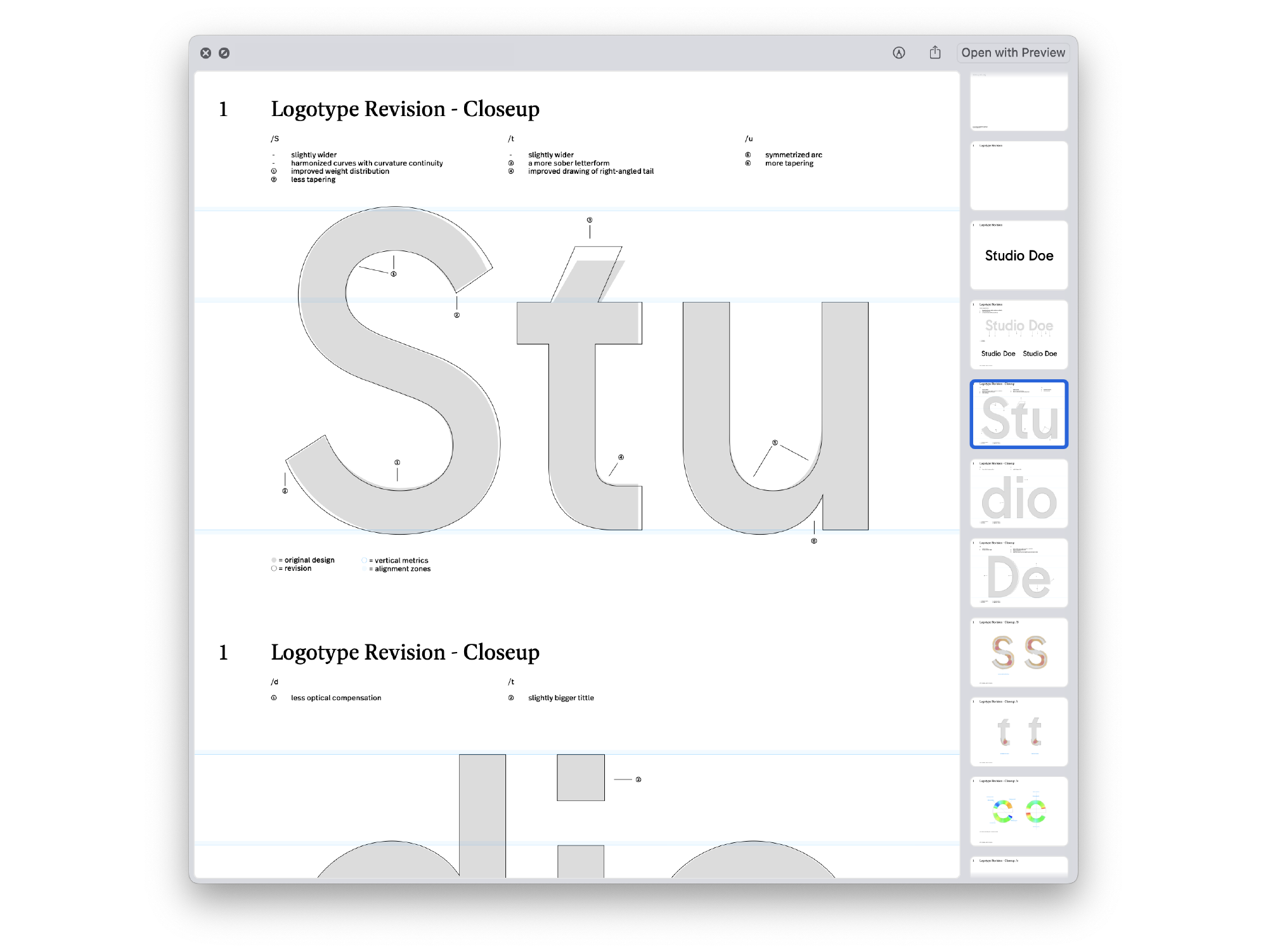
Logotype refinement of Studio Doe, commisioned by Local Remote, 2024. Full case study on Local Remote.
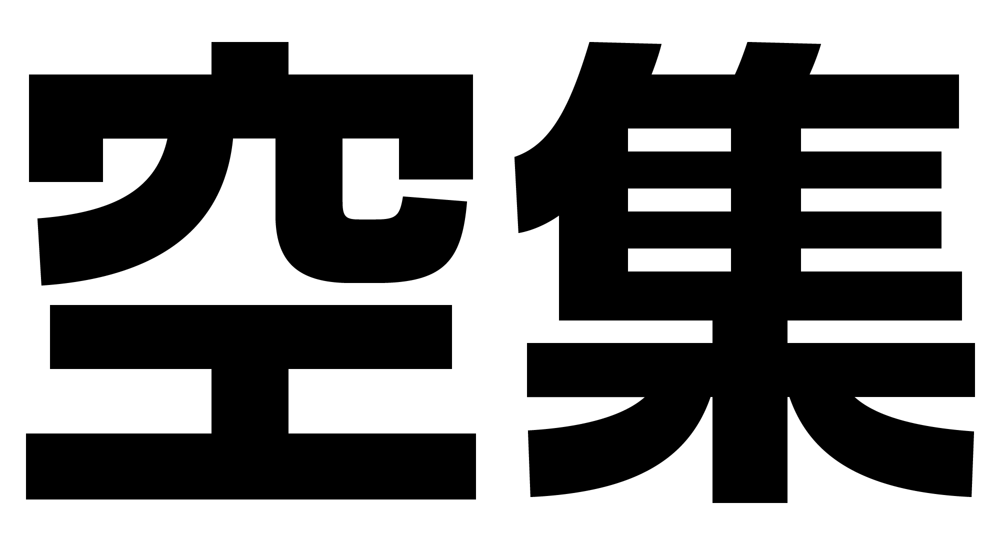
Logotype for NULLS(空集), designed at HOUTH, 2024.
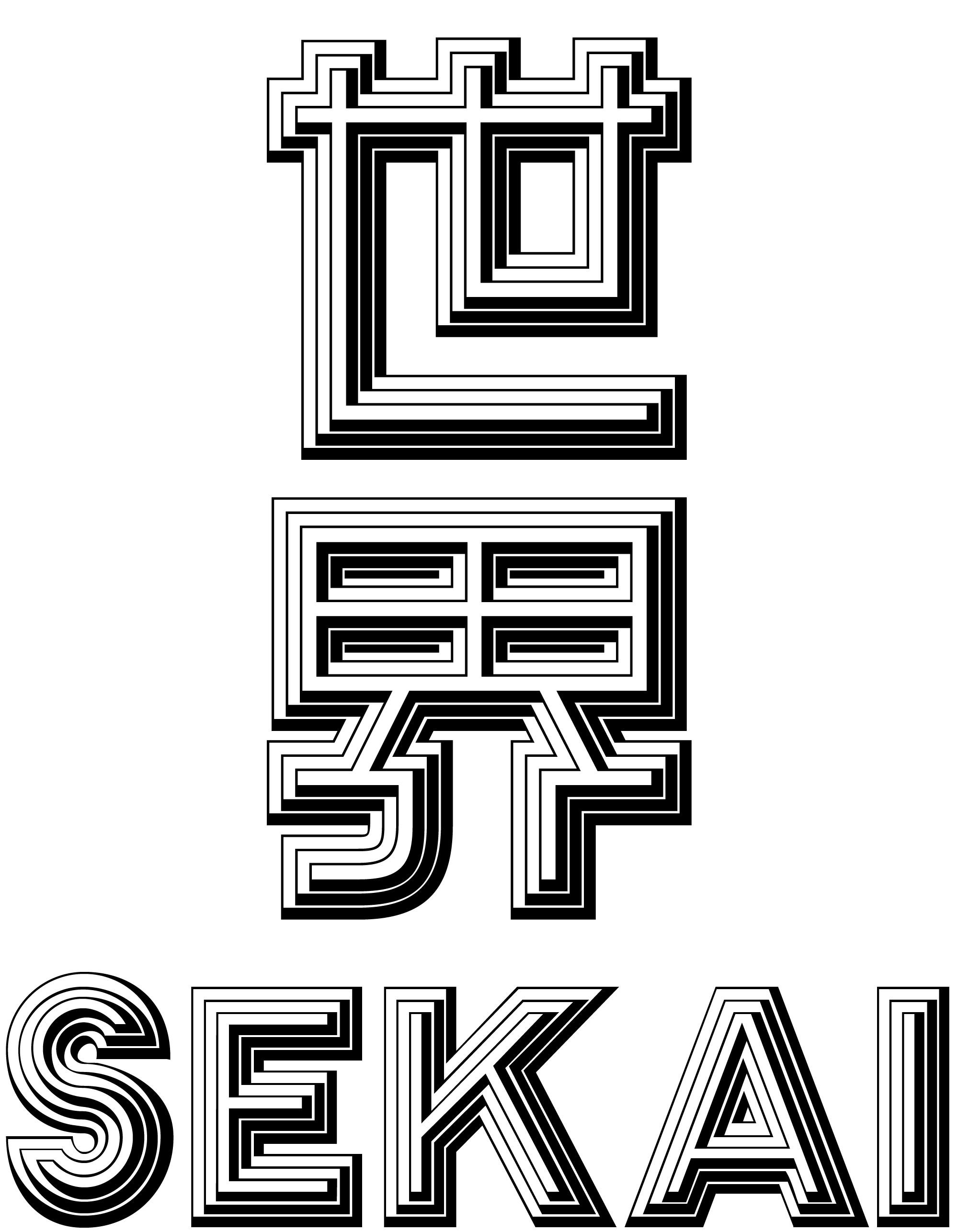
Lettering practice and Kanji/Latin matchmaking of Stack. The Latin shown here is set in CAT Stack.
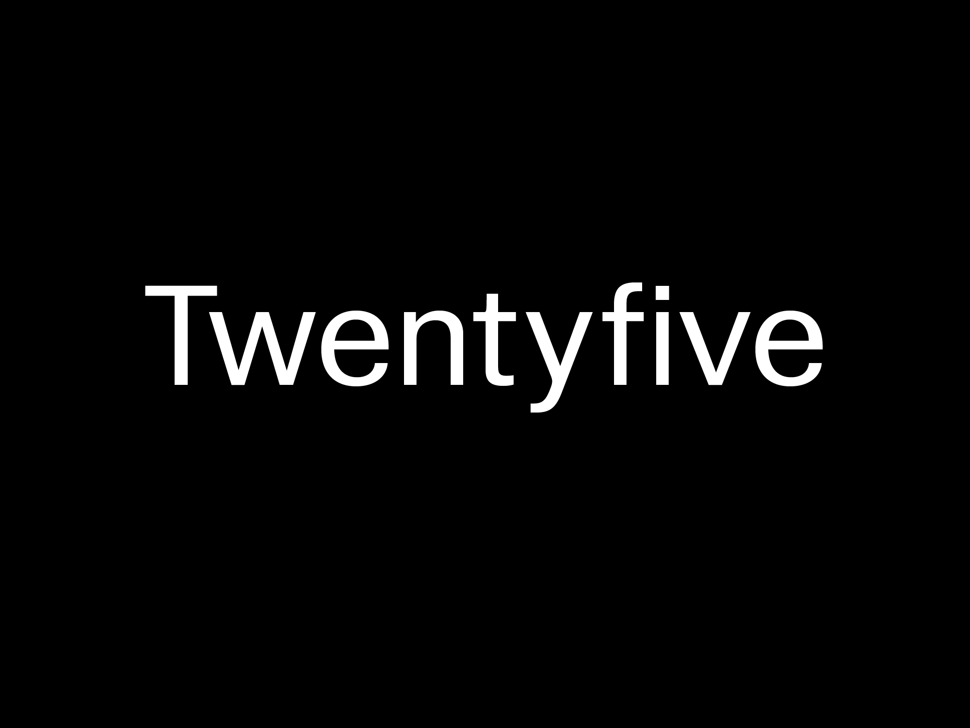
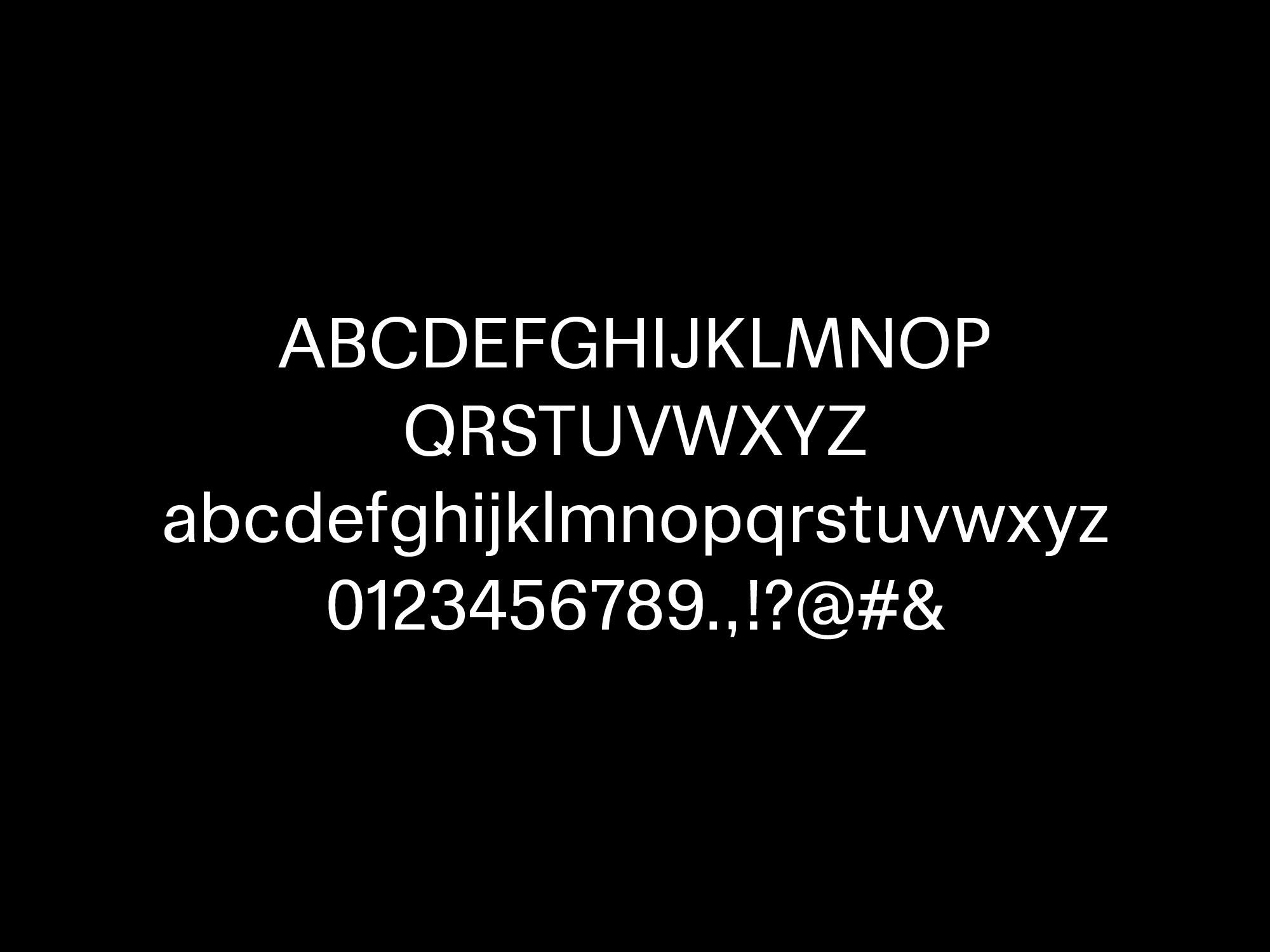
Twentyfive, 1 style(WIP).
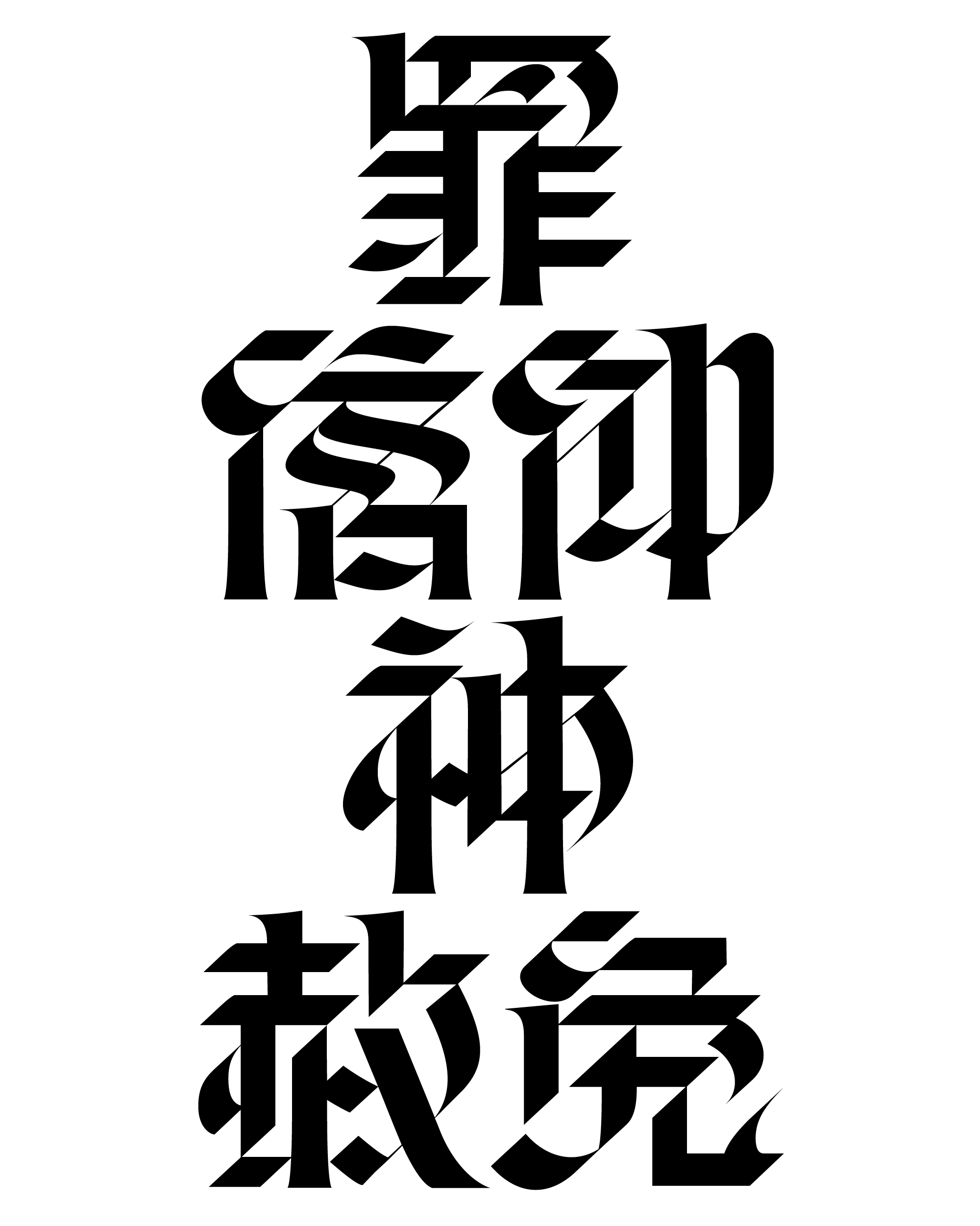
Lettering commisioned by YU98.design, 2023.
Imitating machines?